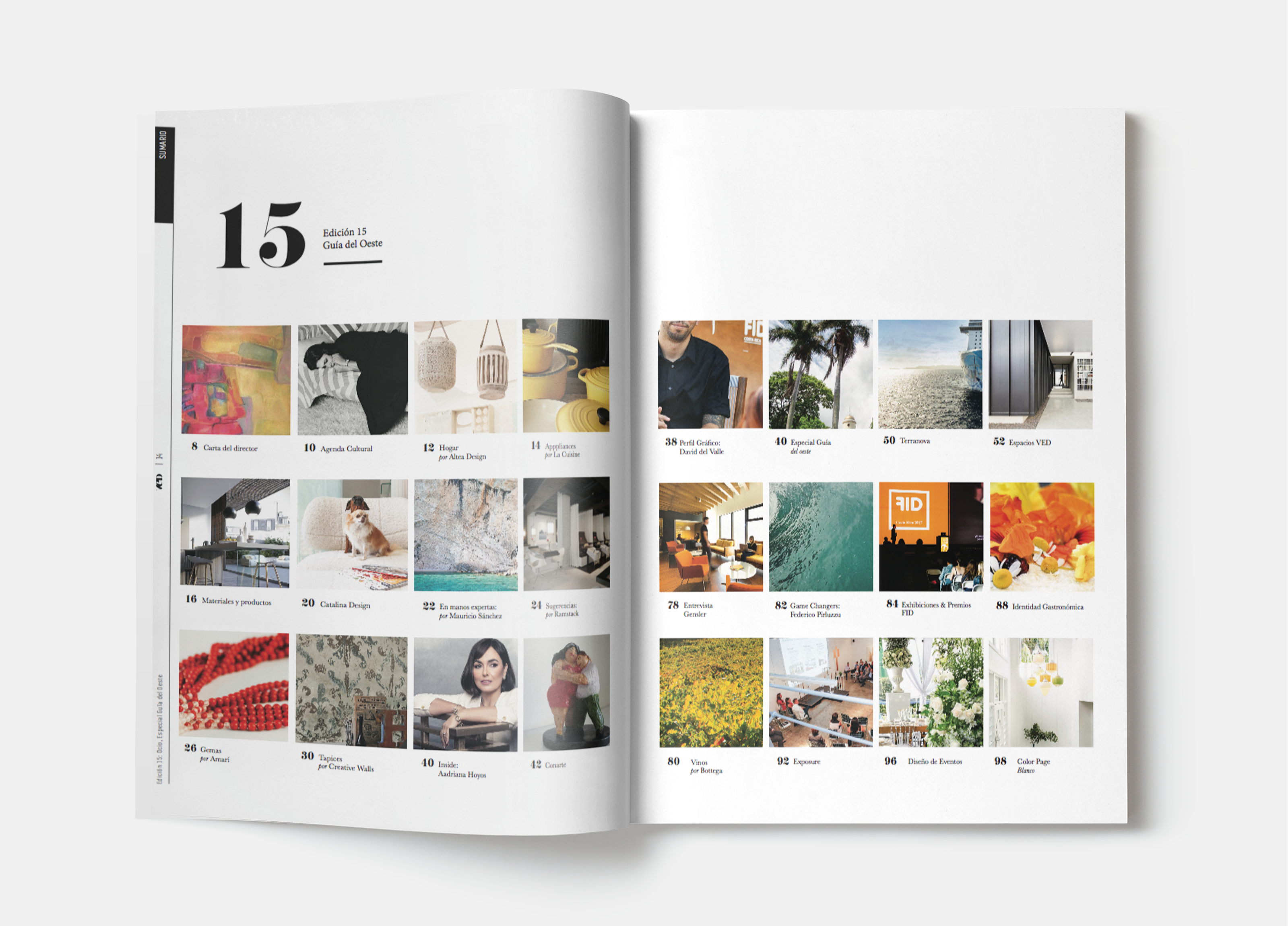
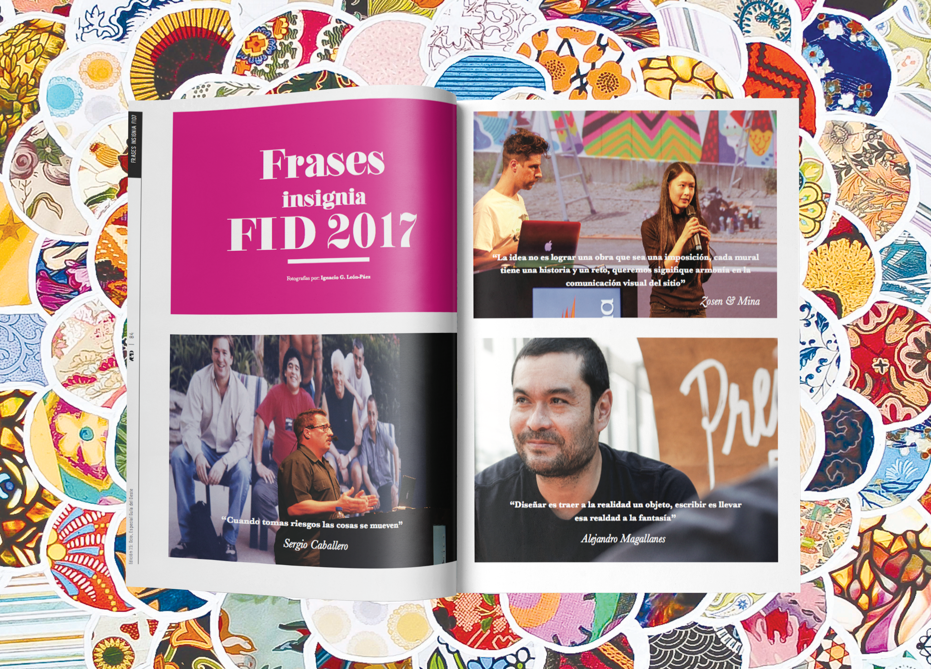
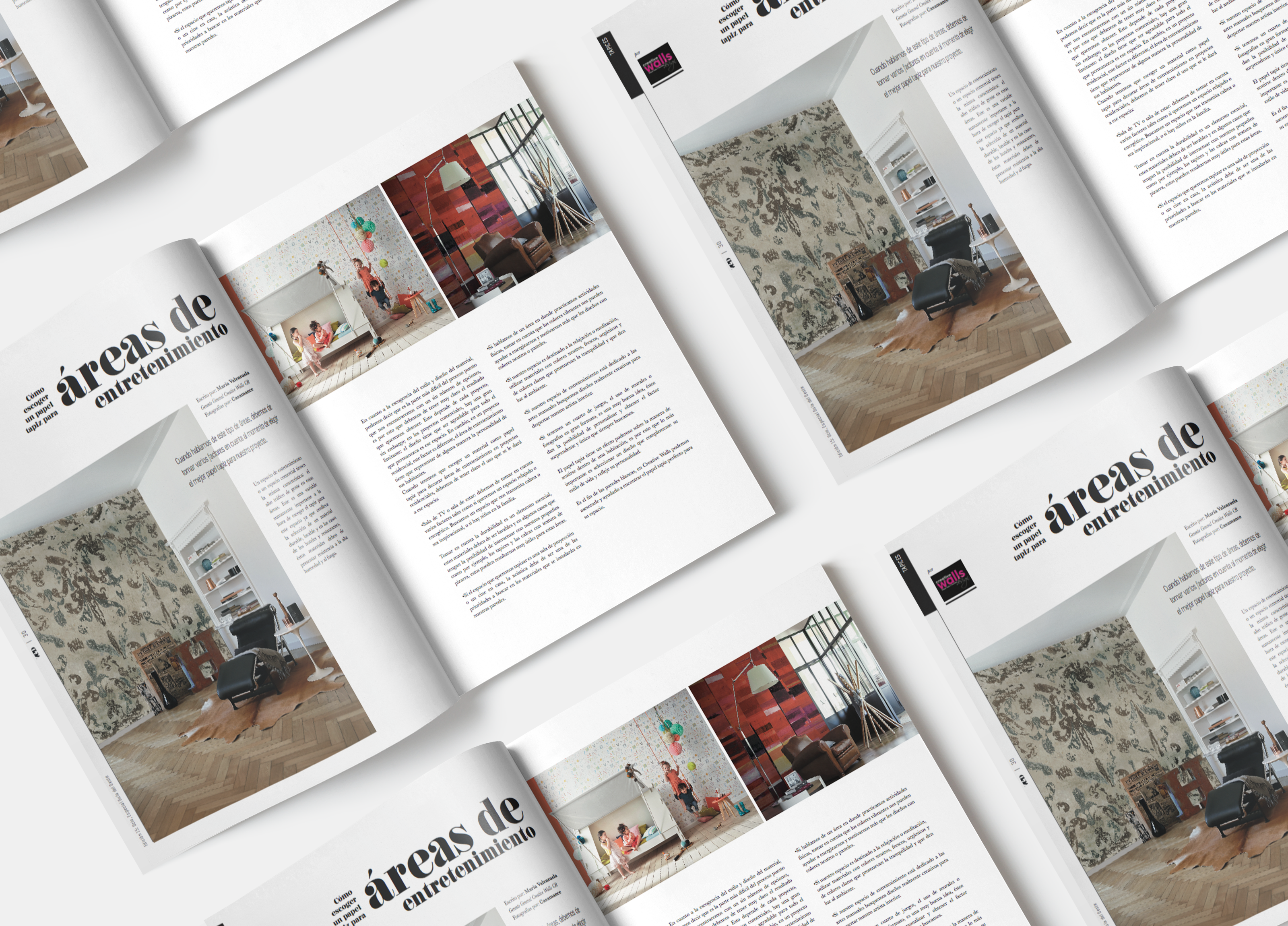
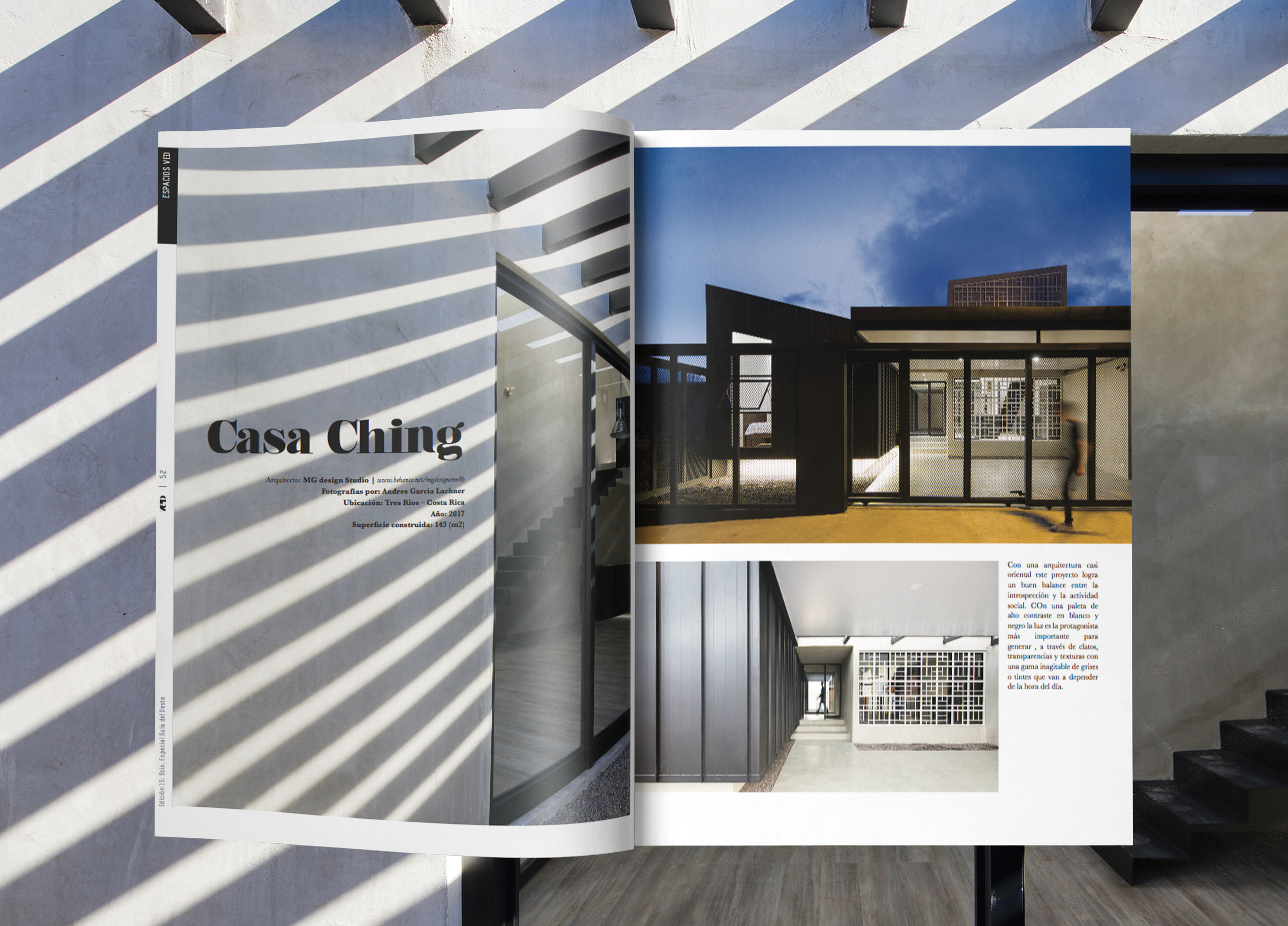
Guía del Oeste, Edición #15, VED Magazine Editorial Design
The Problem
The challenge was to visually capture and convey the essence of time perception and the restorative power of leisure. How can design elements be used to evoke the feeling of “suspended time” and the escape from the daily stresses that these spaces offer? The main challenge was to create a visual language that not only showcases the featured spaces but also communicates the intangible benefits of leisure and the importance of reclaiming our time in a world that constantly demands our attention. This requires a careful consideration of imagery, typography, layout, and overall aesthetic to create a magazine that is both informative and emotionally resonant.
Increasingly, our perception of time is shortening. We don’t know if it’s due to the number of relevant events that society, the world, and different regions of the planet suffer, or because the stress of everyday life steals our attention and the pleasure of enjoying time.
Marco Mora von Rechnitz, Director
The Solution
We wanted to gather a series of spaces designed for pleasure or leisure, spaces that, when we visit them, invite us to enjoy and to responsibly forget the vicissitudes of the present, provoking in us a delightful moment, the suspension of the speed of time, that draws a smile on our faces.
This edition of VED shows some magical spaces, services, and places in the western part of San José city, that offer their attention to any demand of the demanding visitors. Simple tours that, with their corners, manage to surprise and leave for a moment the silence in our thoughts, so necessary to regain the air and energy that sometimes escapes us.
Concept
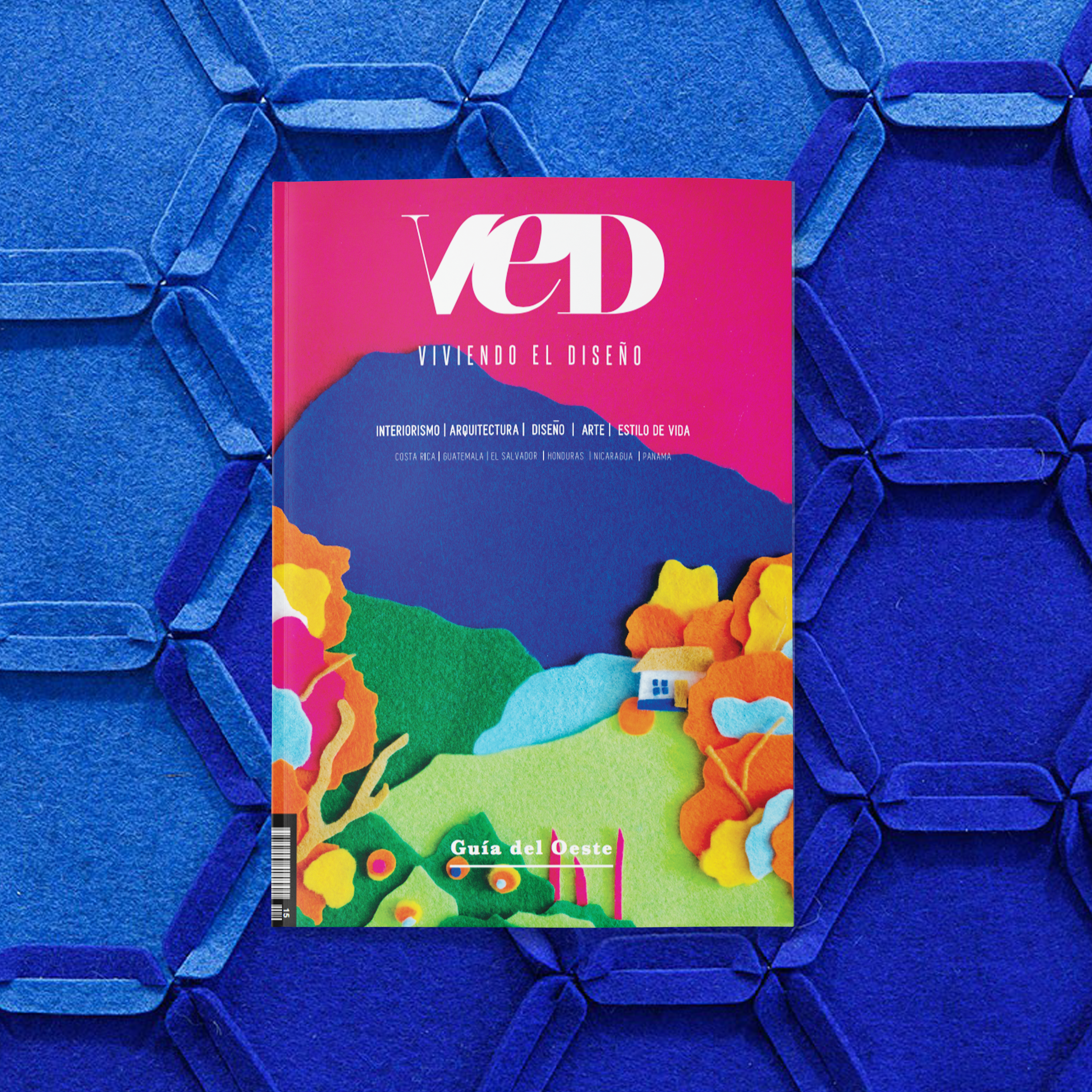
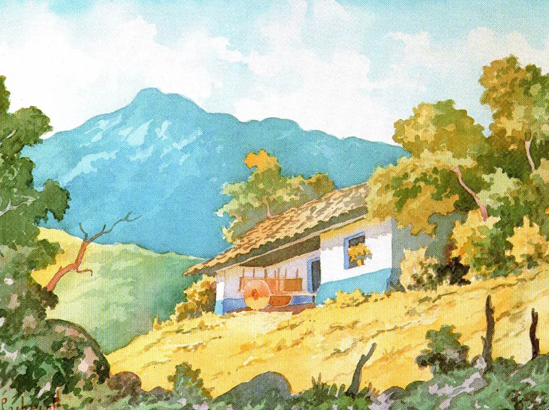
A re-semanticization illustrates the cover of issue #15 of VED magazine. The work ‘Paisaje Nº 22’ (Landscape No. 22) by Costa Rican artist Fausto Pacheco served as inspiration to revive a rural Escazú, amidst mountains, masquerades, marimbas, and typical colorful oxcarts, in the western guide.
Based on the artist’s bucolic landscapes, the theme of nature, and the adobe house as Costa Rican identity, I created a composition with pieces of colored felt, which I later manipulated digitally to transform into the cover of this special edition.
Director: Marco A. Mora von Rechnitz
Sales Director: Maricruz González
Editorial Director: Mariana Sáenz
Art Director and Graphic Designer: Katherine Canales

